
American Bible Society
Brand Design and Creative Direction
The Project
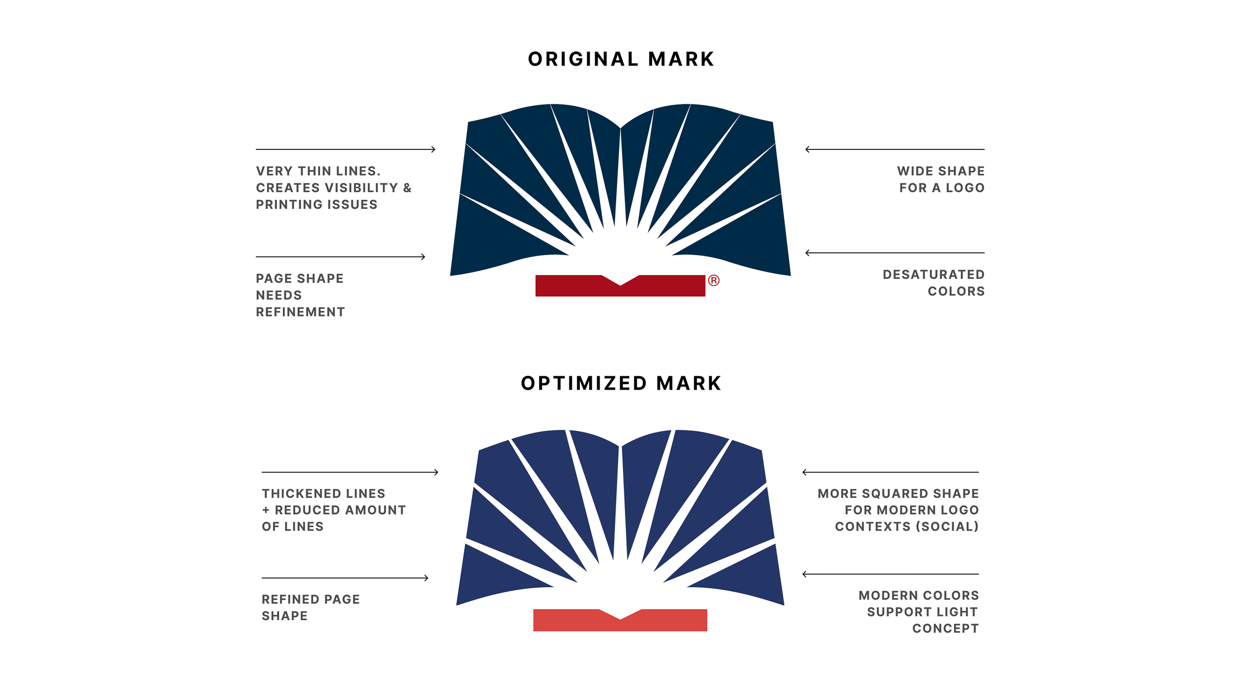
American Bible Society, founded in 1816, is a historic nonprofit whose roots go back to the founding fathers of the United States. Originally conceived as a ministry for distributing scripture to a fledgling nation, their reach has expanded to a wide array of international programs and causes. When I joined ABS as its Lead Designer, my most important task was clarifying and reworking the visual brand for a new era.
The Problem
American Bible Society has 210 years of history to its name. That means two centuries of incredible innovation and credibility. It also means two centuries of change, in which many, many different strategies and visuals were implemented. Over time, the ABS brand became fragmented, and fell behind modern industry standards. With dozens of sub-brands, and a lack of clarity around what exactly the ministry now did in the age of Bible Apps, the problem was acute and unmissable.
Upon a series of leadership changes, American Bible Society initiated a full rebrand effort, seeking to better position themselves for a modern day audience, and focusing on a theme of encountering the Word, not just having it on your shelf.
I was hired as the Lead Designer to oversee the visual identity of ABS, including the development and rollout of the new brand to all audiences and ministries, and developing all resources in accordance with this.
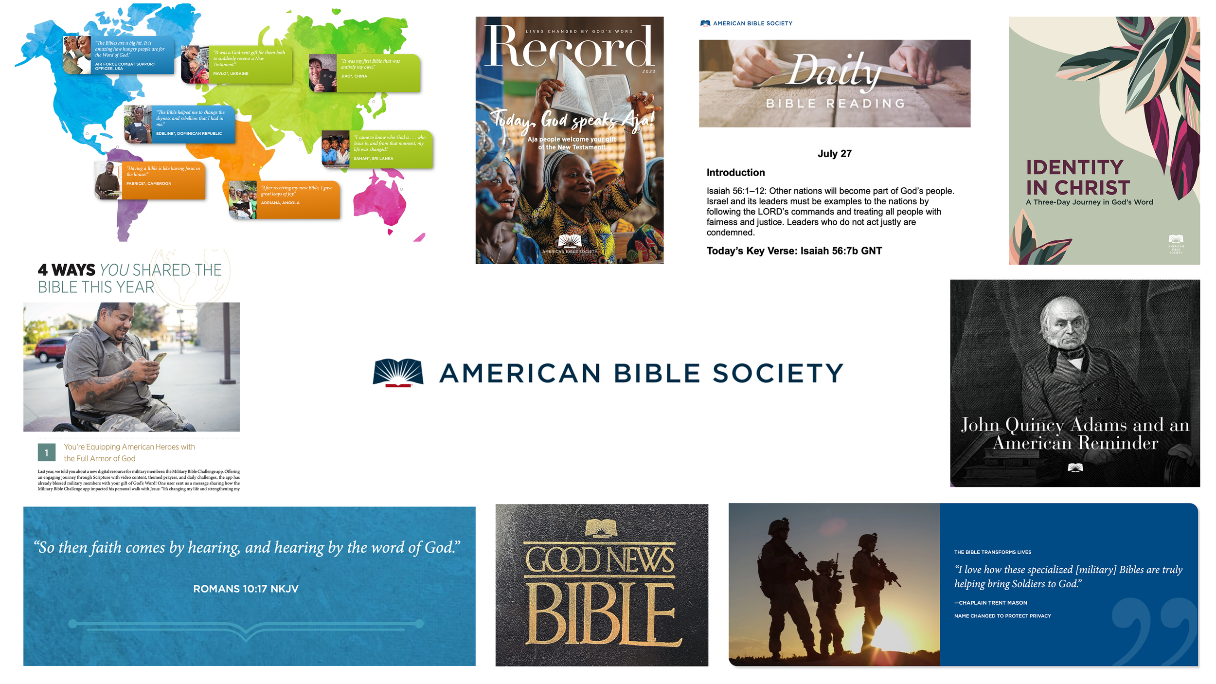
The Strategy
When embarking upon this redesign, we agreed to align on a visual identity that allowed us to “speak in both directions at once”. We wanted to craft a brand that both honored our historical legacy, while also positioning us for a bright and relevant future.
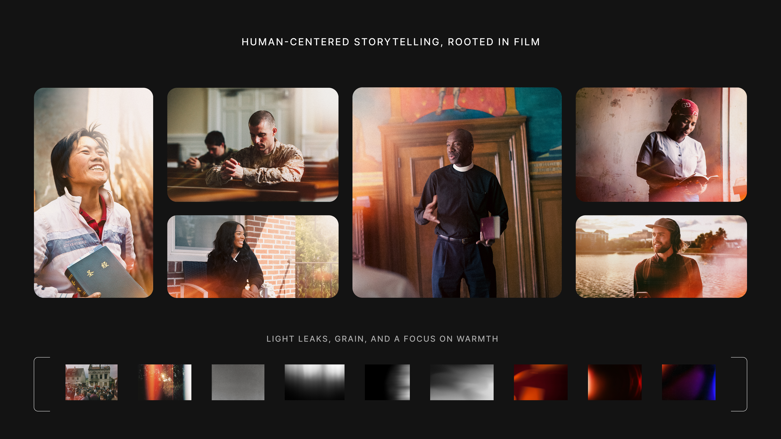
We found our answer in the idea of light. Light is a common motif in scripture and culture for God’s Word, signaling how encountering Christ can illuminate your life in new ways. We also wanted to emphasize an organic, human-centered approach in the new identity, strategically differentiating our brand’s tone and real-life field work in an age of digital and AI.
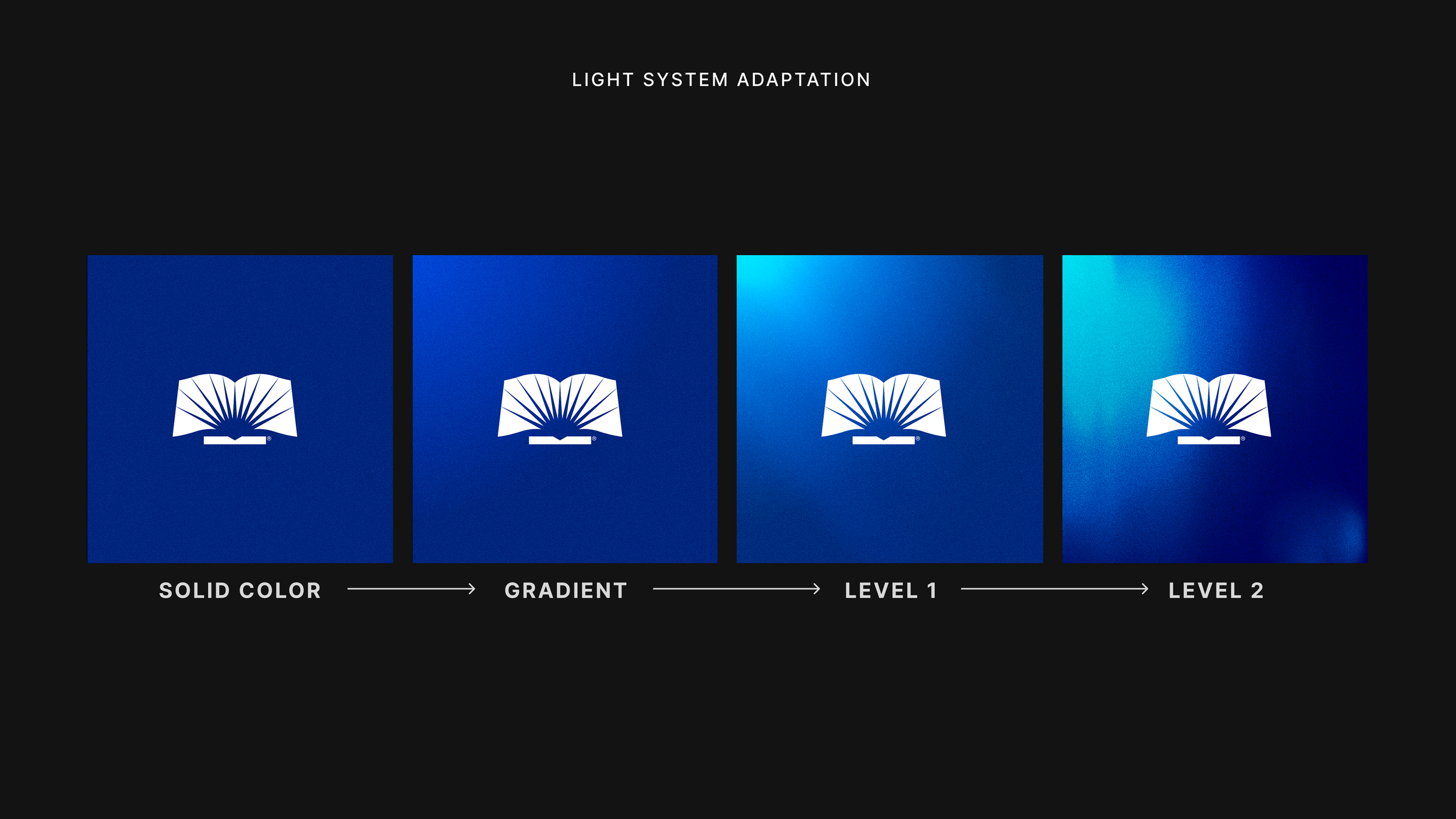
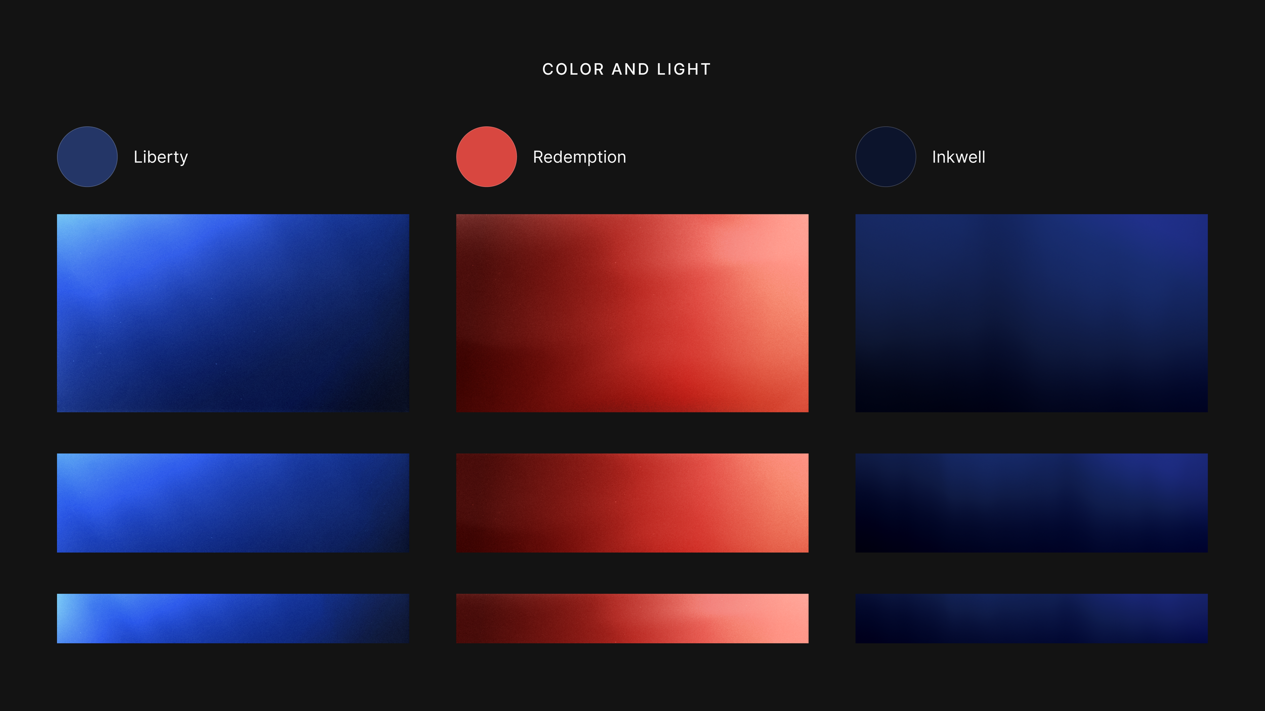
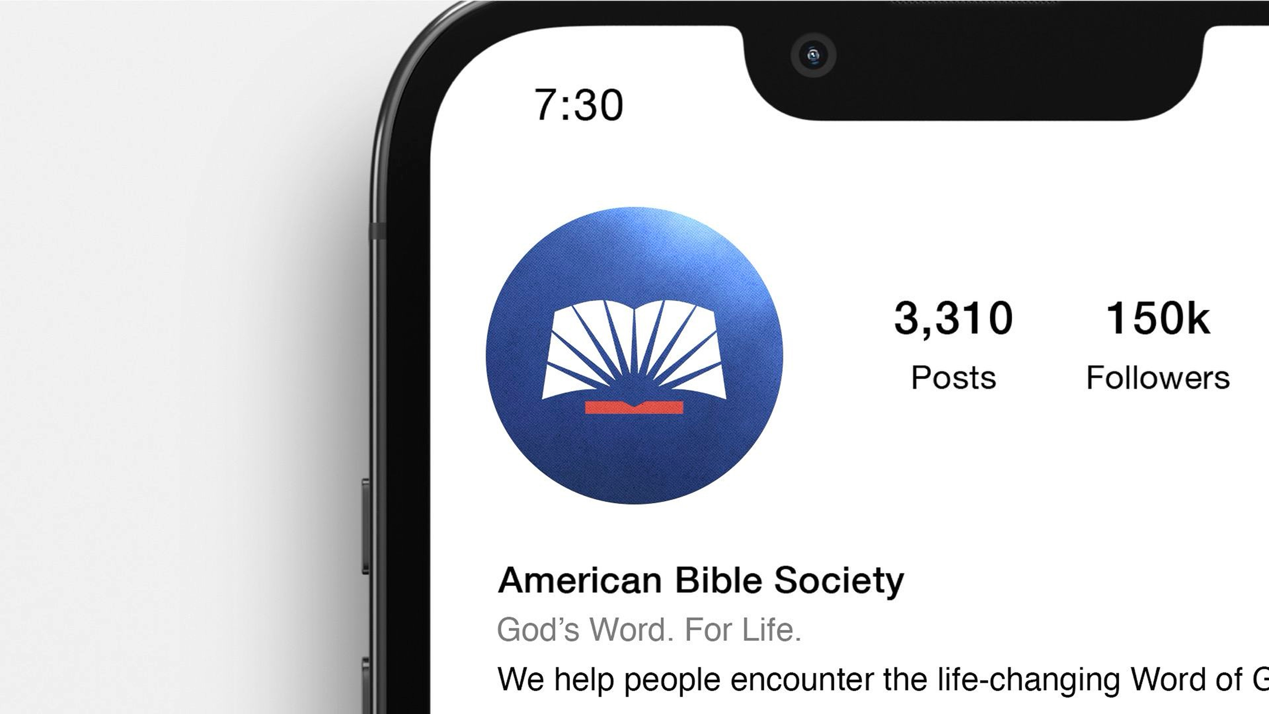
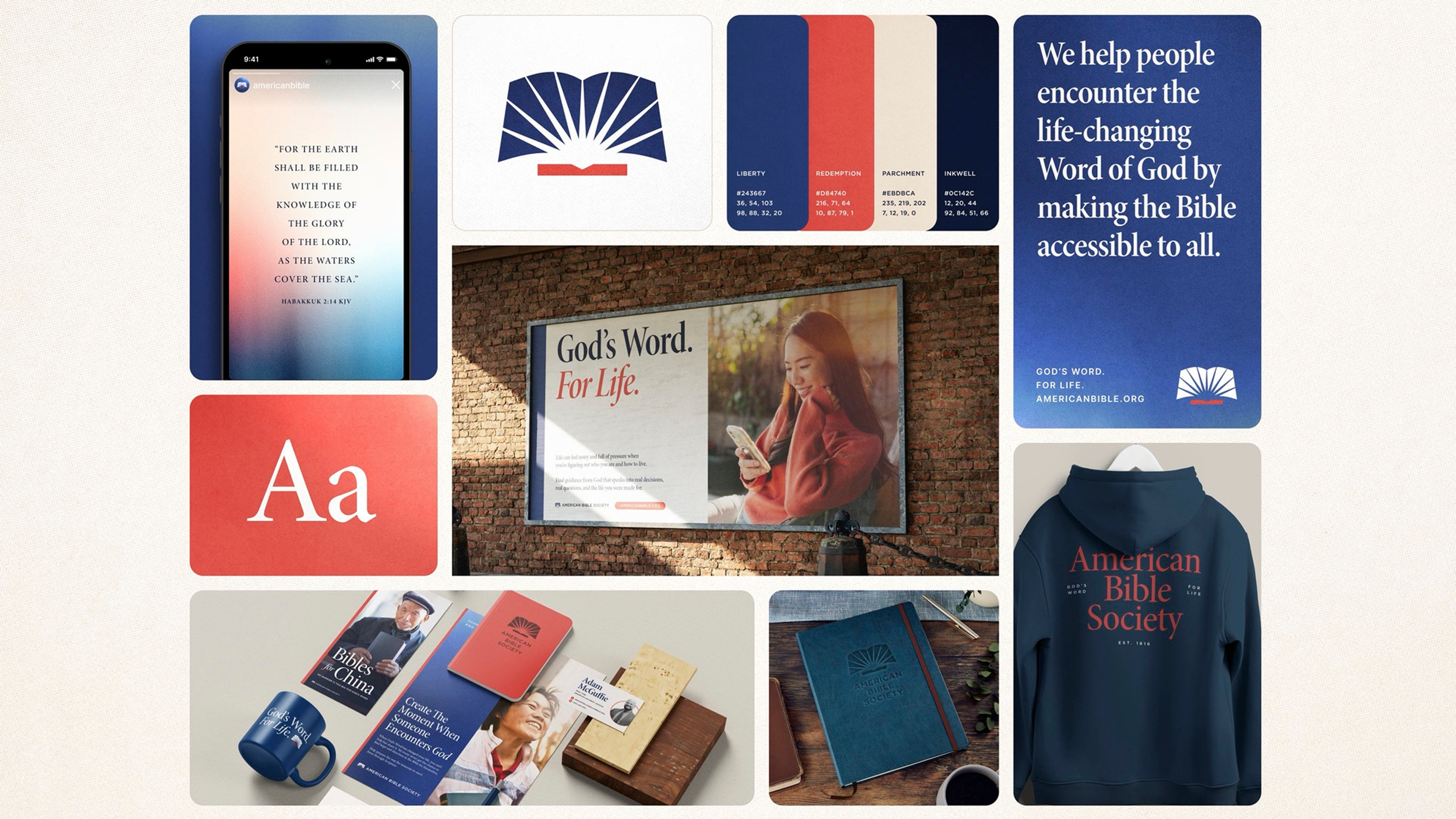
Using these concepts, I developed The True Light System, an approach that utilizes the grain and light leaks of film to drive a feeling of warmth and people-focused storytelling. This approach was combined with an expanded color palette of refreshed reds and blues, a reworked main logo, and a switch to a more editorial style in type and layout. The adjustments were made so that the system could maintains its historical American roots, but also bring something fresh to the conversation with Millennials and Gen Z.
All of these changes added up to a “modern museum”-style brand—one that knows the power of its legacy, but doesn’t remain stuck there. It uses it as a catalyst to push the mission forward.

Application
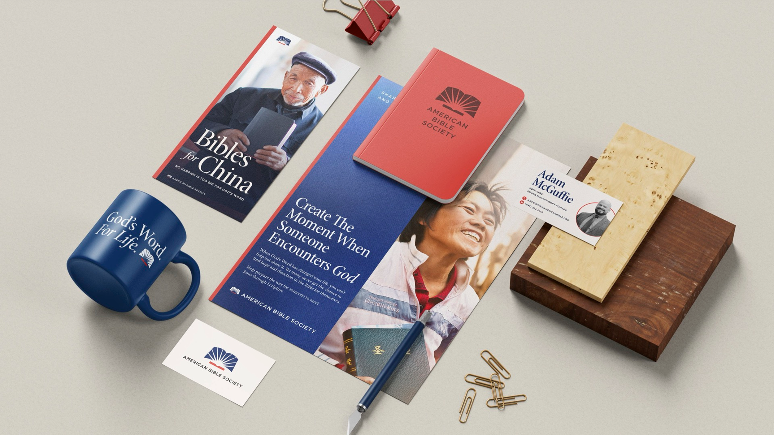
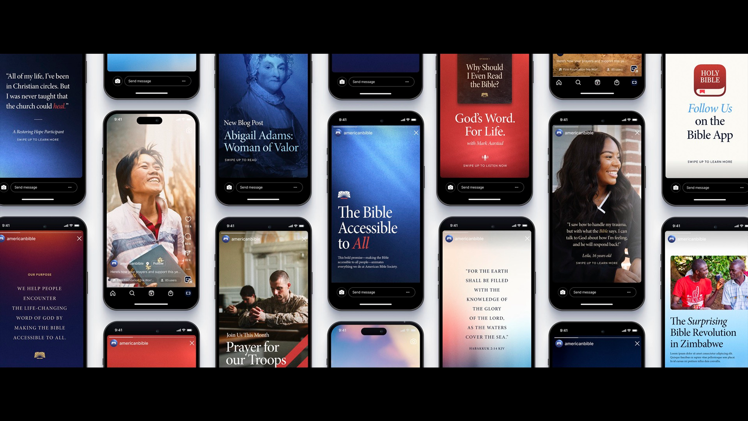
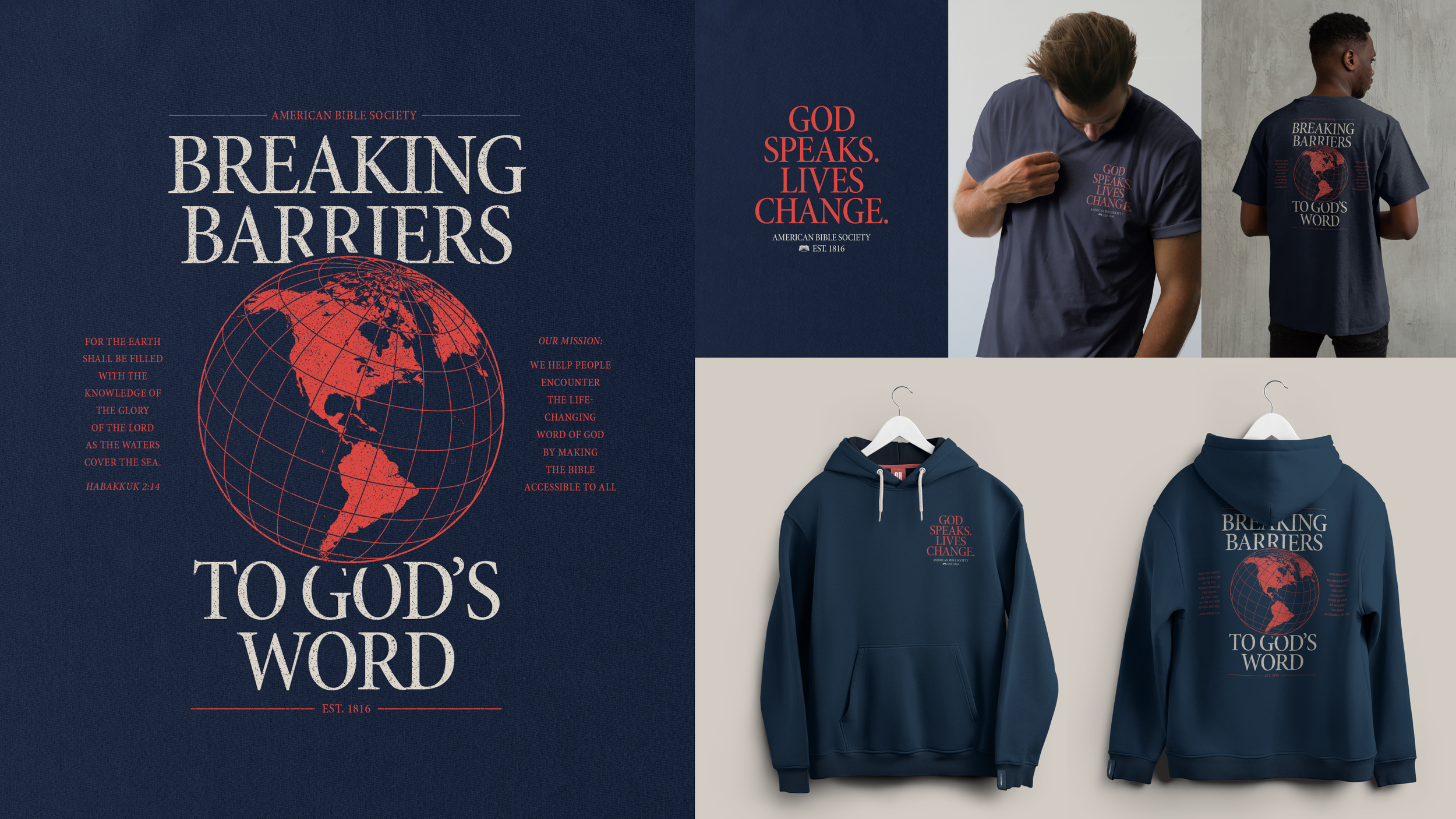
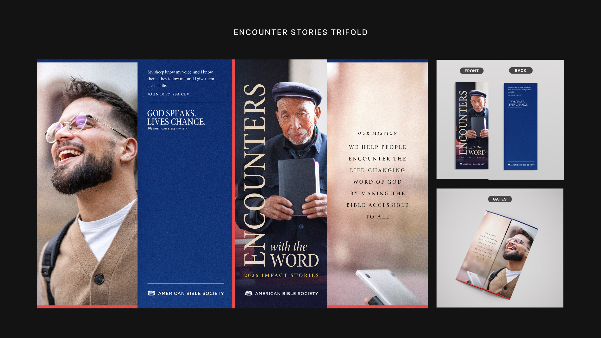
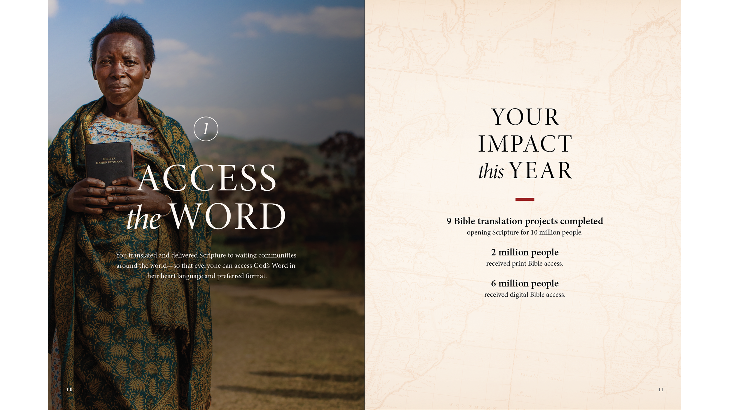
After landing on a final visual style, I created several applications in preparation for our reveal.
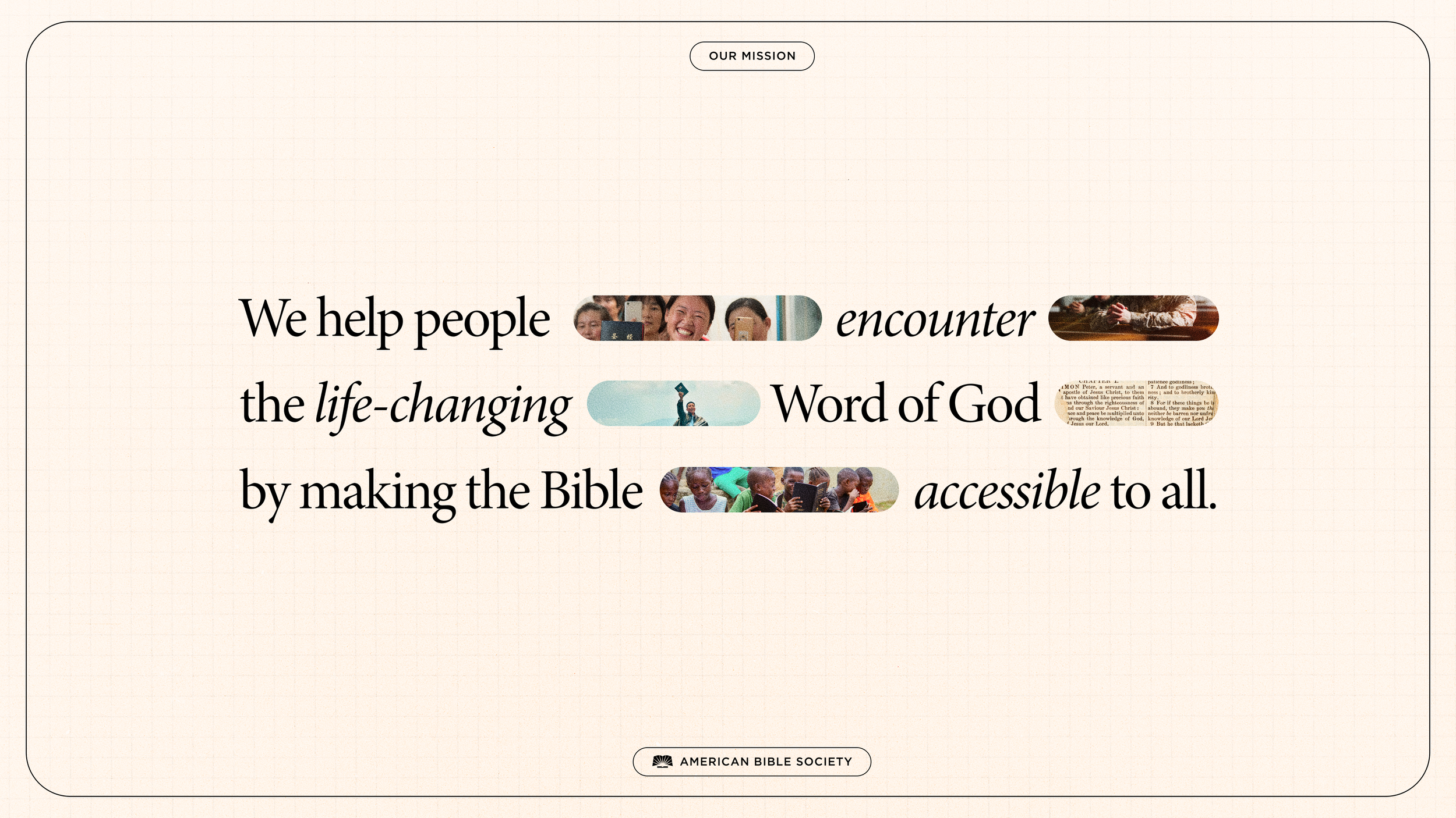
While the brand is still being actively developed in preparation for our September launch, the images below demonstrate the range of both application and tone this system can perform.


Ready to begin?
I’d love to talk and see how I can help, even if you’re still researching or figuring things out.